


The new identity allowed Dalena to step forward with confidence, showing up consistently across her platforms with a brand that matched the caliber of her work. D.D. Craft Studios now communicates its creativity and professionalism clearly, helping Dalena attract both individual clients and potential business opportunities while carving out a bold presence in her space.
これは:
X -pression

仕事
チャンネルファクトリー

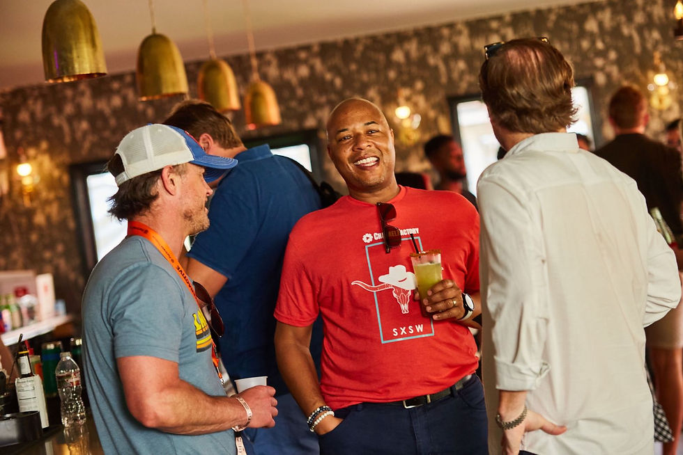
ブランディング、ソーシャル、イベント、デッキ、デバイス。これらはすべて、Channel Factory がブランドが広告費をより有効に活用するためのギャップを埋めるのに役立つ方法と、より「意識的な」広告分野に移行している理由を物語っています。私たちは毎日、絶えず広告にさらされています。そこで、どうすれば目立つことができるのか、どうすればブランドがオーディエンスとよりうまく連携できるのか、という疑問が生じます。


Dalena Do, had a bold vision but lacked a brand identity that captured it. Dalena’s work ranges from garments to shadow boxes to one-of-a-kind creations, but her brand wasn’t reflecting the professionalism, creativity, and sharp personality behind her craft. Without a cohesive look and feel, it was difficult for her to stand out or clearly communicate the unique edge that sets her work apart.
Her goal was to have a brand that felt both polished and playful—professional enough to be taken seriously in the design world, yet fun and vibrant enough to honor the eclectic spirit of her studio. She needed grounding foundations that could unify her diverse offerings into a clear, memorable identity.
これは:
X -pression


これは:
X -pression
I guided Dalena through the process of clarifying her brand values, vision, and goals. Together, we outlined not just what she makes, but why she makes it, and how she wants her audience to feel when engaging with her work. We also explored her dream clients and collaborators, to ensure her identity would connect with both personal buyers and prospective business partners.
Alongside that internal exploration, I conducted audience and market research\-looking at competitors in the fashion and craft spaces to understand where she could carve out her niche. This gave us the framework to create a brand identity that was not only true to her artistry, but also strategically positioned to capture attention and trust.


From these insights, I built a visual identity that embodied her personality: sharp, bold, and playful. We designed a color palette that was as vibrant and unique as her creations, while grounding it with professional consistency so the brand would feel confident and trustworthy. The overall direction gave her social media, website, and visual materials a unified look that reflected the same energy and creativity she pours into her craft.
The direction also focused on balance—making sure the brand felt accessible and fun, but elevated enough to show her as a serious designer. The end result gave D.D. Craft Studios a strong foundation to grow from, no matter how eclectic her projects became.
これは:
X -pression
手紙
– Building cohesive visual identities that align with client values, mission, and long-term vision
- Guiding the look, feel, and tone of projects across digital, print, and experiential platforms
- Translating research, audience insights, and client goals into creative concepts that drive engagement
- Crafting narratives that merge design, photography, and motion to elevate brand presence
- Ensuring design systems carry seamlessly across social media, and print
トップに戻る
ビュー:
さらなる仕事


