


The result was a cohesive, elevated brand that now shows up consistently across platforms. Souls Moving Mountains came away with a visual identity and voice that reflects their authority, their vibrancy, and their heart-making them not only more attractive to potential clients, but also more confident in how they show up as leaders in their space.
これは:
X -pression

仕事
チャンネルファクトリー

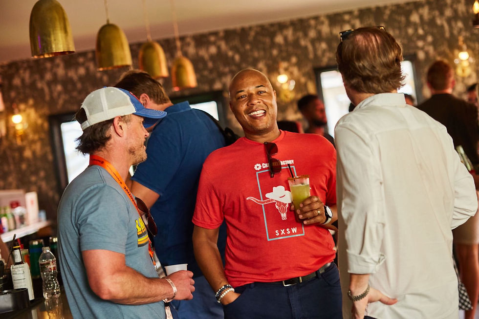
ブランディング、ソーシャル、イベント、デッキ、デバイス。これらはすべて、Channel Factory がブランドが広告費をより有効に活用するためのギャップを埋めるのに役立つ方法と、より「意識的な」広告分野に移行している理由を物語っています。私たちは毎日、絶えず広告にさらされています。そこで、どうすれば目立つことができるのか、どうすればブランドがオーディエンスとよりうまく連携できるのか、という疑問が生じます。


Savannah and Jenny, the mother–daughter duo behind Souls Moving Mountains, had grown far beyond the branding they started with. While their work was rooted in deep plant medicine and coaching practices, their identity no longer reflected the wisdom, authority, and vibrancy they brought to their clients. Their online presence felt inconsistent and didn’t clearly communicate who they were becoming or where they were headed. Without a strong foundation, they struggled to attract both their ideal clients and potential collaborators.
Their brand needed grounding-a clear sense of self, voice, and visual direction that could hold the weight of their transformation work, while still capturing the magic and energy they embody.
これは:
X -pression
-09.png)
-12.png)
これは:
X -pression
I started by taking them back to the beginning-helping them define their brand values, mission, and “why.” Through guided exercises, they wrote out their dream client and vision, which gave us a clearer picture of where they were going. From there, I paired their self-reflection with audience and market analysis, so we could understand not just who they wanted to reach, but how to stand out in their space.
This strategy gave shape to their voice and presence. It allowed us to bridge their academic backgrounds in science and psychology with their spiritual wisdom, creating a narrative and brand identity that was both grounded and magnetic
-28.png)


With that foundation, I developed a refreshed brand identity that spoke to both sides of their work: the depth and authority of their knowledge, and the sparkle and vibrancy of their personalities. Their social media look and feel was reimagined to be consistent, professional, and aligned with their values-while still being colorful and inviting.
The direction emphasized clarity and resonance. Every element, from color palette to messaging, was designed to attract the clients and businesses they wanted to work with, while positioning them as trusted guides in their field.
これは:
X -pression
手紙
– Clarified core values, mission, and positioning to ground the brand in who they are and where they’re going
- THelped define their tone of voice and storytelling approach to reflect their wisdom and vibrancy
- Researched competitors and ideal clients to uncover gaps and opportunities in their space
- Developed a cohesive look and feel across social and digital platforms to unify their presence
- Translated their academic and spiritual roots into a brand that balances authority with magic
- Built systems that allow them to show up as trusted guides while attracting both clients and collaborators
トップに戻る
ビュー:
さらなる仕事


