


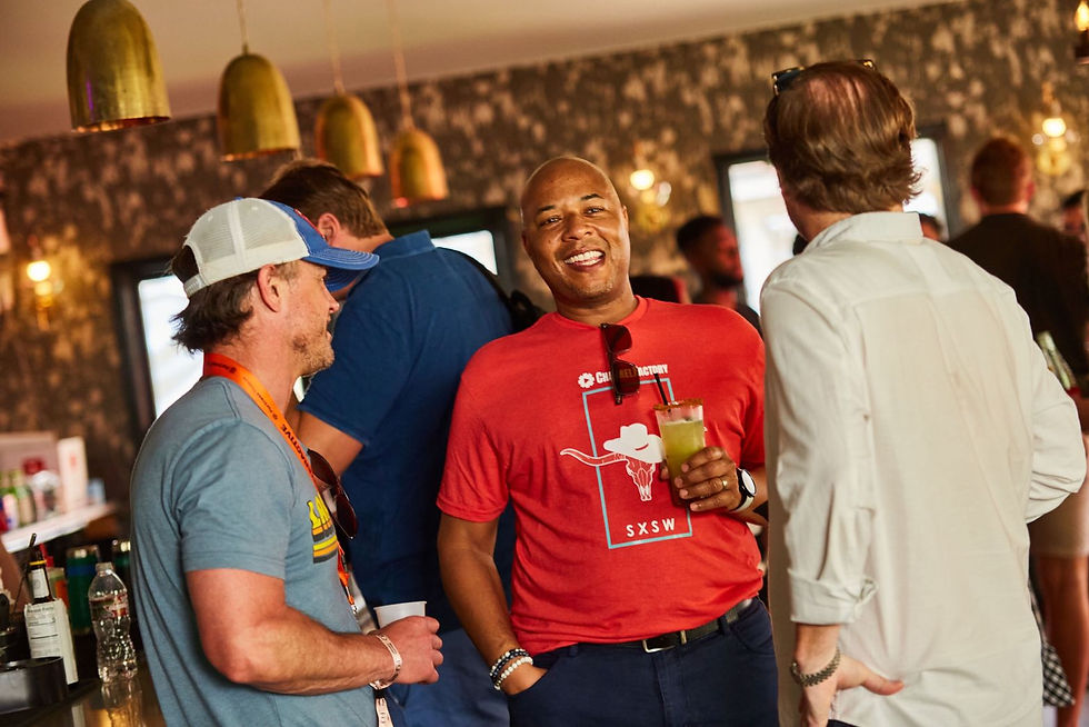
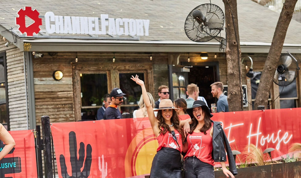
Presence that is both seen, felt, and measured. Social media presence continued to grow into thousands. Events like Cannes Lions, SXSW, and smaller activations across US cities were much more curated, landing success with clients and partners, old and new. The brand had presence that is memorable, and true to it's mission and core tenants bringing much more credibly & trust.
THE
Impact

AD tech

Channel Factory
Channel Factory can help bridge the gap for brands to better spend their ad $$$. As we're moving into a more 'conscious' area of advertising. Constantly bombarded by advertisements every single day, so this begs the questions-how will we stand out, how we help brands better align with their intended audience?


The brand initially was quite scattered, a lot of inconsistency in who the brand was and who it needed to be. Old logos still being used, no real identity and visual story to help them be truly memorable. The old brand style was heavy and masculine, created in a time where it worked and you just keep going in the fast paced start-up world. I came on to help develop a new brand marketing materials that reflected their core mission, values, and identity. The brand started to change and become something completely different- it finally felt alive.
Now 2 years in, after refining and establishing the majority of the brand look, feel, bringing more streamlined consistency across all US assets it was decided to do a Brand Refresh. Between myself and two other designers, we had to tighten the consistency across the global market- as APAC had it’s own version of Channel Factory that did not line up with how US and EMEA were designing the brand. This created an opportunity to adjust the many intricate parts of the brand. Now I won’t include any materials of the new branding. All the materials below is a glimpse of how I took the old brand, refined it’s edges, adjusted its vision, into something that can be felt.
THE
Problem
THE
Strategy
As always, research the competitors, clients, the ad tech niche at large, tech giants. Looking at the bigger picture to the micro details within that picture- what is making some of these brands establish more trust and authority over the other? What are the foundations of the Channel Factory brand - it’s voice, its statements, who the hell was this brand and what was it trying to accomplish?
To design anything starts with the understanding of the brand and business itself as well as the market. My goal was to connect the brand back to itself and who it truly was so it could connect more deeply with it’s audience and its clients. This helps build a better stable foundation for authority. The initial designs were made in December 2021 starting with event designs and social media. This acted as a tangible starting point for experimenting with brand colors, photography, motifs, etc. The early designs showed really, who the brand no longer was, it only helped to further clarify and refine what they needed and how the audience reacted to this new version of Channel Factory.


Turning ambiguity into something that can be seen + felt. I worked with the Marketing Director, who gave the high-level vision + feedback for the brand’s trajectory, as well as the social media manager, who had a pulse check on our audience,media, and trends. From there I took the idea and expanded it. Pulling back the usage of black and focusing on more use of red, white, and grey. Giving more depth with placement and shadows to show the brand in a more dynamic way.
Events were the playground we could fully dive into curating each event experience into something magnificent. Each event was molded specifically depending on location and activations. Social was a chance for the brand to expand and show the core of who it was and how it can speak to clients needs. We made a foundation for the brand to live in, and grow in- on social media, events, to internal decks and media. Tightening areas on inconsistency with parameters yet, giving the brand some breathing room to grow.
THE
Direction
ROLE & FOCUS
– Established a robust B2B branding suite, ensuring clarity and cohesion across all channels.
- Directed the development of marketing materials that balanced warmth, inclusivity, and high-level professionalism.
- Elevated event experiences (Cannes Lions, SXSW) that supported high-profile client relationships.
- Increased client engagement by 20% through curated visual identity across ads, events, video, decks, and web.
- Partnered cross-functionally with marketing and dev teams to execute launch strategies across EMEA & APAC markets.
- Led concept development and market research to align creative direction with audience insights.
VIEW
More Work


